

 Jay Wilson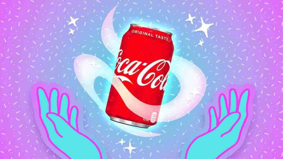
If you asked anyone to name five food or drink brands off the top of their head, I’d imagine that Coca-Cola would be mentioned pretty quickly. It is, undeniably, one of the most recognizable brands across the globe, not just in the drinks sphere – and a huge part of that (perhaps the main part) is down to its logo. That cursive, calligraphic font. That red and white color scheme. It’s genuinely iconic.
Videos by Sporked
And now, The Coca-Cola Company hopes that it’ll be more iconic than ever. It’s just announced that it’s refreshing its logo and can designs, ever-so-slightly, while also pushing for a more cohesive look across its markets. Here’s what it’s doing.
Taste That? It’s The Sweet Taste Of Consistency
A few days ago, The Coca-Cola Company announced its “new global visual identity system,” which, in essence, introduces uniformity across its products. In doing this, it’s accentuating some key features in its logo, which will lead to its bottles and cans looking just that bit more old-school and classic. The idea is that there’ll be a bit more of everything, and every element of its already fairly minimalistic design will be amped up. Or, to put it in Coca-Cola’s words: “The bold red and white palette, the uplifting Dynamic Ribbon, the impactful Arden Square, and the unmistakable Spencerian script will be more prominent across packaging, retail environments, equipment, and digital experiences.”
A snazzy, fast-paced promotional video showed this in action, demonstrating the new typefaces Coca-Cola would be using across its packaging, and showing a slight thickening of its ribbon and font. Customers will likely notice the biggest change on its cans, which will now have a vertical logo running across their body, as opposed to bisecting them. As for Coke Zero, its cans and bottles will now have a white font on a red background, while its cans will have a black ribbon, and its bottles will have black caps.
When Will These New Designs Be Rolled Out?
As a global change designed to create cohesion, eventually we’ll all be drinking from the same can, so to speak – but the alterations to its designs will happen slowly and incrementally. Coca-Cola notes that “the new look is rolling out across Latin America, Europe, Middle East and Asia,” but it might take a while before everything’s in place. The US, though, might not see these augmented designs until 2027 at the earliest. They’re coming, though; you best believe it.

 Gwynedd Stuart
 Jordan Myrick
 Ariana Losch
Thoughts? Questions? Complete disagreement? Leave a comment!